Tag: travel

  • The Esplanade Library – A Memory

    The Esplanade Library – A Memory

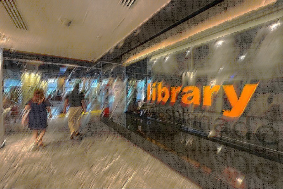
    I miss the Esplanade Library.

    It will forever remain as one of my favourite places in Singapore insofar as my memory stays in tact, and undesirably but ineluctably, accompanying that memory, lies a deep grievance that such a treasure of a place is now gone – targetted, enveloped and destroyed into bits (yet again, as I see it) by commercial interests and utilitarian intents:

    “Singapore’s only public library dedicated to the performing arts – library@esplanade – will close on June 30 (20231), and its collections and programmes will be moved to the National Library Building in the Bras Basah area… the move will allow it to centralise its arts resources in the heart of the Civic District, where they will be close to arts institutions and practitioners in the area…

    The premises currently occupied by library@esplanade will be converted by Esplanade – Theatres on the Bay into arts and commercial spaces…” (Source: The Straits Times)

    – as if a library is no more than a mere transferrable storage warehouse for books and resources, and place-making all but non-existent – even despised? Well, on the one hand, this should not be surprising for such is the natural outcome of a society that knows the price of everything but the value of nothing, where all interests are essentially utilitarian and economically motivated, where places exists primarily for the sake of efficiency, productivity, and – who are we kidding – profitability. And so, all who get in utility’s way will be wallowed up, dissolved, and remade into its image.

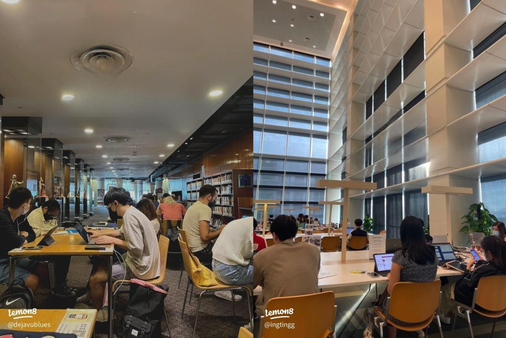
    Is it no small wonder then that the National library (yes Singapore’s flagship library) looks and feels atrociously sterile resembling a laboratory (or if you prefer, a learning laboratory) for rats and machines for production purposes rather than a warm and inviting space for learners to find solace, delight, and inspiration to explore, connect, and create? Look at the comparison between the exterior of the old National Library and the current, and then the interior of the current National library against the then-Esplanade Library:
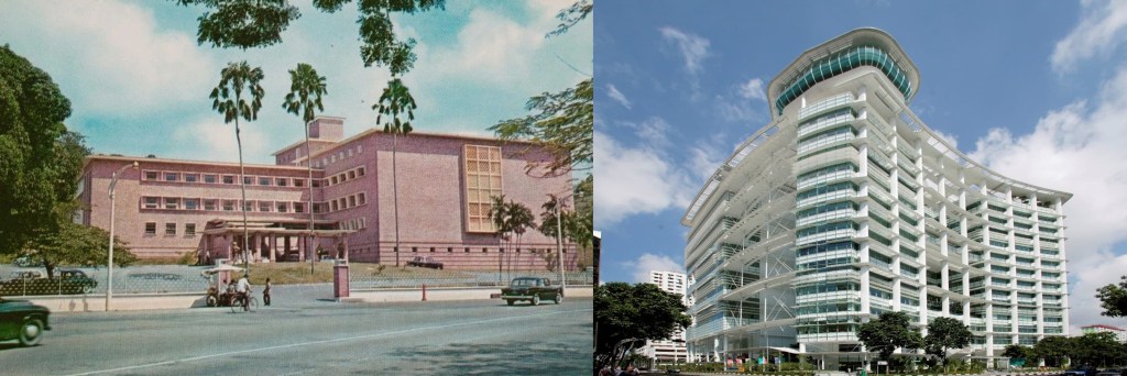
    The Rustic Charm of the Old National Library against the Sterile-looking “Learning-Laboratory” National Library of the present (Image sources: Roots and NLB)
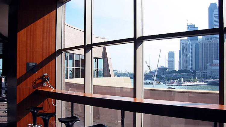
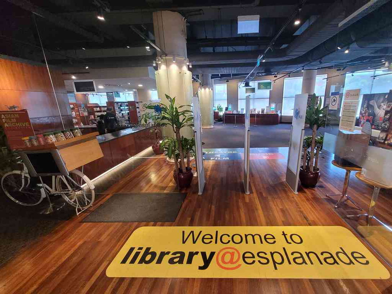
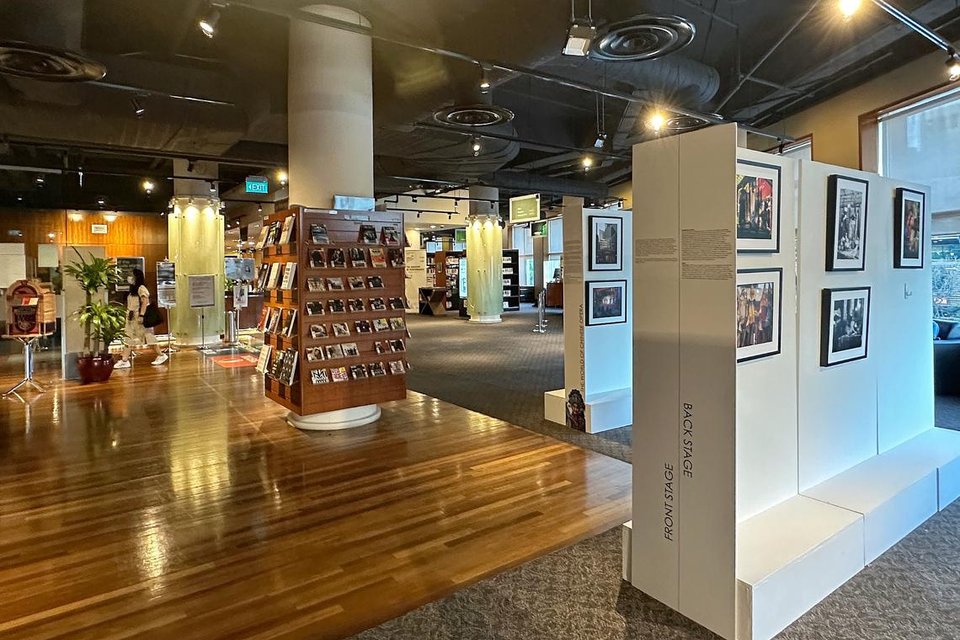
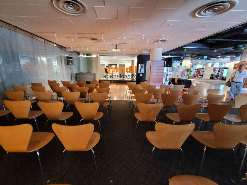
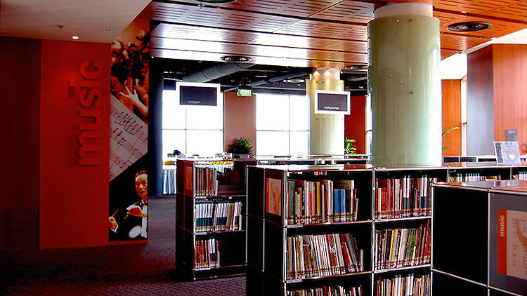
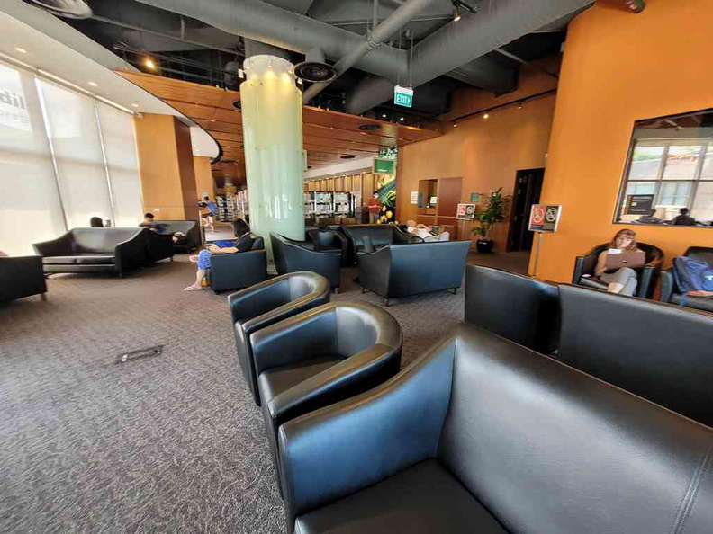
    The ‘homeliness’ of the Esplanade Library of the past (left) against the laboratory-like tables of the present National Library (right) [Image source: Lemon8]

    As it is, as mentioned, on the one hand, it should not be surprising to witness the failures of our country’s conservation efforts and declining quality of buildings for they merely reflect our culture’s core beliefs but yet on the other hand, in spite of one’s preparedness, the shock and sadness that result in actually losing a beloved (be it a person or place or anything for that matter) must be squarely acknowledged…


    I know not when that I encountered the space,
    But pleasantly surprised was what I felt,
    “A library in the Esplanade?
    “Now that’s interesting.”

    In curiosity’s trial I treaded along,
    Up the escalator and around I turned,
    Greeted by art which adorned the side-walls,
    Admiring-walking…
    I encounter an impasse
    – Or so I thought.

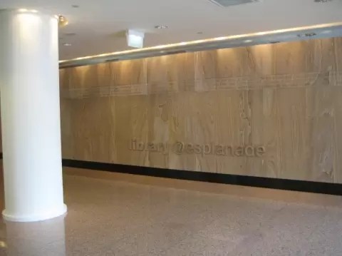
    On the woody wall the engraving is there:
    “library@esplanade” to direct one’s path.
    And so I resumed walking along,
    an intriguing opening materialising before my eyes…

    The entrance.
    Spacious, warm, and inviting.
    Clearly distinct from its paquet flooring,
    Extending around
    To the performance stage.
    A hallowed ground?
    A defined entry?
    A crossroad I say
    To decide the next route.

    To the left three things stand out,
    two involving seats, and one an art display.
    On the latter,
    Many a time I have paused to look
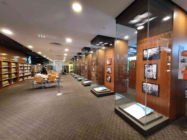
    At the art encased in the column rows,
    Lining up toward the tables and chairs
    – the study area that is –
    That place I spent
    In hours galore
    To get work done
    Or simply to read.

    The other seats are one-of-a-kind.
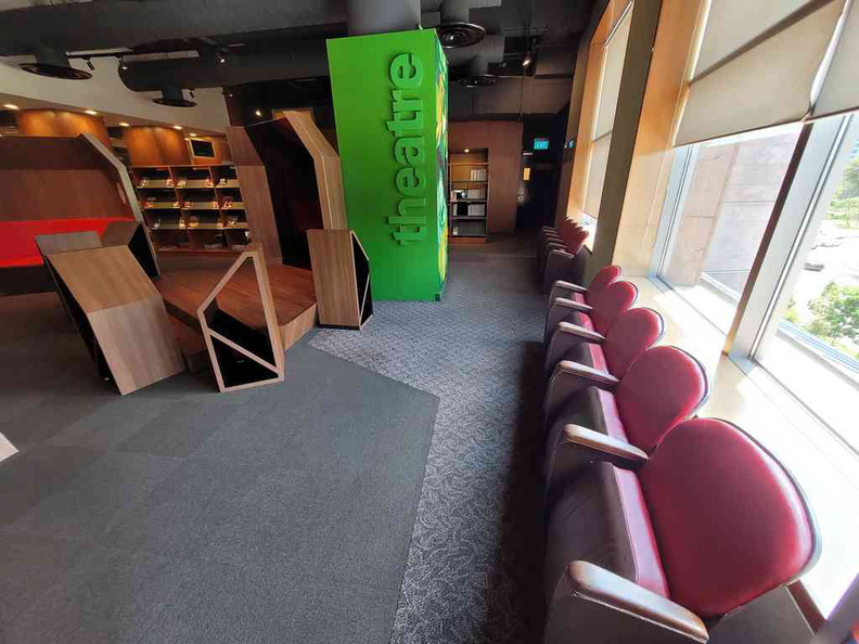
    For those puffy red chairs are found in cinemas no more.
    They clang and cling when one uses them,
    But still it’s a joy to give them life.
    For their comfort?
    Not so much.
    But for their uniqueness and richness?
    Most absolutely yes!

    To the right from the entrance,
    Gives a different vibe.
    If the left wing is Yang,
    Then the right wing is Yin.
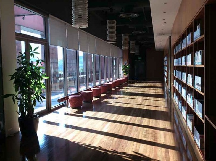
    Mellow, dark, and subdued in buzz,
    Yet not a cave but a haven light-shone,
    Where one can bask
    In the silence and sights…

    And if you’re lucky,
    From time to time,
    Sounds adorn the silence,
    Free and Raw,
    That refreshes and sparks,
    Of all attuned,
    The pleasures to have,
    When live music is heard.

    So why would you steal,
    This treasured place from us?
    Lessoning the count
    Of spaces adored
    – of places tried?

    If it’s progress you say that warrants such acts,
    Then why does it feel that the opposite is true?

    A sense of connection
    Eroding away,
    Giving way to function
    Disregarding form.
    Beauty bereft
    Efficiency King,
    Leave no room for structures
    That provide no price.

    And so it was
    For the 21 year old library,
    In what remains –
    A memory.

    *Featured Image Source: The Straits Times

    1. It officially opened on the 12th September 2002. ↩︎
  • Kinto Water Bottle: Fluid Pottery

    Kinto Water Bottle: Fluid Pottery

    Doesn’t Beauty, although “useless”, nevertheless hold a mysterious grip among its enraptured beholders? Oscar Wilde once remarked that to put usefulness first, we lose it. But to place beauty first, what we do will be useful forever. And part of the reason that beautiful everyday objects will be “useful forever” is that it is conserved and cherished by the user by virtue of the object being beautiful – and that is exactly what I experienced with my Kinto Water Bottle (as with the case, in a larger scale, of historical buildings being conserved and not destroyed due to their beauty – watch “Why Beauty Matters” at the 17:20 mark).

    My Kinto water bottle is the first water bottle that I actually cherish. Here are three actions that I wouldn’t do for any other water bottle:

    1. Not bring it to the tennis court (I play tennis) and place it on the dirty floor.

    2. Leave it to dry when not in use so as to prevent algae growth.

    3. Look at it repeatedly and think to myself, “what a lovely water bottle this is.”

    Indeed no other water bottle has caught my attention as the Kinto water bottle for its curved shapeliness that is, first of all, unique to say the least but also creating a seamless form from bottom to top analogous to a pottery piece deserving of display. Its plastic (made from recycled material) is sturdy and perspicuous like glass – that also comes in five colours (clear, amber, smoke, blue, green) and three sizes (300ml, 500ml, 950ml) – which paired up with its soft curves amplifies the pleasure of looking at the water contained within as if the water is at one with the bottle.  

    Kinto Water Bottles in five colours and three sizes
    Kinto Water Bottles in five colours and three sizes (Image Source: Shopee)


    Drinking water from the bottle also feels great due to its “practical size sprout” which apart from being designed for easy refilling and washing also enables one to drink comfortably, and exceptionally so I must say – no awkward contortion of lips to get a sip as we do for some water bottles! Also, the lid opens with just a few twists which – to my surprise – does aid in the ease of the drinking-water experience as does the handle moulded to the lid contributes greatly to the portability department in enabling one to pick up the bottle and to make carrying it around a breeze.

    Ought “form follows function” or “function follows form” in the creation of everyday objects? I say, both are essential but the best marry both in perfect unity and harmony as in the case with this Kinto Water Bottle – as I would term it: Fluid Pottery.

    *Featured Image Source: My Own


    If you like click and purchase the Kinto Water Bottle here: https://amzn.to/43WuTN9. I may earn a small commission if you do so but at no additional costs to you. Thanks for your support, Cheers! 

  • BiC Japan Clic Gold Ballpoint Pen: Ordinary, not!

    BiC Japan Clic Gold Ballpoint Pen: Ordinary, not!

    I have to admit that my first reception of these pens were like “oh, another hotel pen” – you know those black ballpoint pens (yes, I first received the black version) available on the reception desk often with a cable or string attached for visitors to use (before wide-spread digitalisation) or those found in hotel rooms with a notepad.

    To which my giver retorted, “No, they are not! They are special and made-in-Japan.”

    So I gave it a second look, and concluded still, “nah, it is ordinary”, until I started using it…

    [Admittedly, this is not the first time that seemingly ordinary-looking objects “grew on me” (see The Bag My Friend Gave), and I wonder if there is always an element of hiddenness in the truly beautiful which requires time for the beholder to uncover and see.]

    “The grip and feel of the pen actually feels great” was what I found myself thinking after a couple of days of usage. The smooth veneer of the pen is pleasurable to touch, glide – and swirl (if you’re into it too) – and the grip is comfortable to hold with fingers fitting nicely at the pen’s narrower tip. Clicking the pen also felt good in its firmness and slight pushback, and the tip leaves a fine (it has a 0.5mm ball diameter) unique greyish-black trace that does not smudge easily (which is a plus-point I like).

    In the looks-department, adjectives such as “elegant”, “sleek”, and “classy” begin to replace “ordinary” in my mind’s judgement of the pen, and with it also a realisation of the increased frequency and duration of my glances, admiring its shapeliness and base colour against the gold trimmings and platings. And so it was in the midst of my enjoyment, that it had to happen:

    I lost it.

    Not in misplacing it but (this is rather embarrassing:) in swirling my (only) black “Clic Gold” pen out from my hands into the inaccessible recesses of the underside of immovable furniture, to oblivion. A sure case of tough luck, that is.

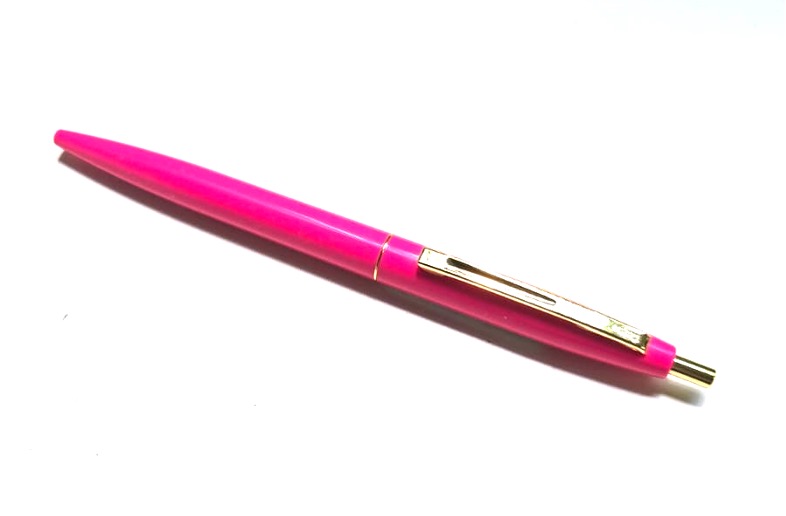
    But – yes, but – as luck providence would have it, I needed to wait just a couple more months before receiving more “Clic Gold” pens from my empathetic and generous friend (who came to know of my dismay), and this time receiving back not only the black variation but also obtaining another colour variant: shocking pink (see below)!

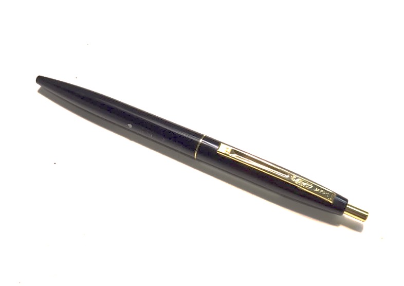
    BiC Clic Gold Ballpoint Pen Pink

    Image Source: My Own

    As I surmised and later discovered, the “Clic Gold” range does indeed contain a melange of colours which you can even mix-and-match with (visit here to experiment and see my video below)!

    Image Source: Amazon

    In all, the BiC Clic Gold pens are ballpoint pens suited for everyday usage with an affordable price but more: they remain one of my favourite (if not my favourite) ballpoint pens for its casing-feel, elegant-look, colour-variety, and reliable ink-trace. I highly commend them for personal use and/or gifts! And if anybody ever comments that they’re ordinary “hotel pens”, you can consider responding as such:

    “No, they are not! They are special and made-in-Japan.”

    *Featured Image Source: My Own


    If you like, click and purchase the pens here: https://amzn.to/4jcuWIR. I may earn a small commission if you do so but at no additional costs to you. Thanks for your support, Cheers!


  • The Bag My Friend Gave

    The Bag My Friend Gave

    It might strike you as strange that I’m writing about something so banal as a bag. For to some, bags, in the barest sense, are merely upgraded “plastic bags” which one can sling on one or both shoulders and/or hand carry from one locality to another, and therefore it seems inane and absurd – even ludicrous – to dedicate a post about it. Still others who are perhaps not quite extreme utilitarians in their regard of bags (but nevertheless made of the same ilk:) who actually like the look of bags and might even own lots of them but somehow never look past them as being mere show-pieces for status, or trophy-rewards of one’s merit, will probably also be surprised at such a post dedicated to a bag. And then there are those in which the description, “bag lovers”1 (that is, loving bags – in all its functionality and design – for its own sake), truly applies, who alas might resonate with what I have to share here.

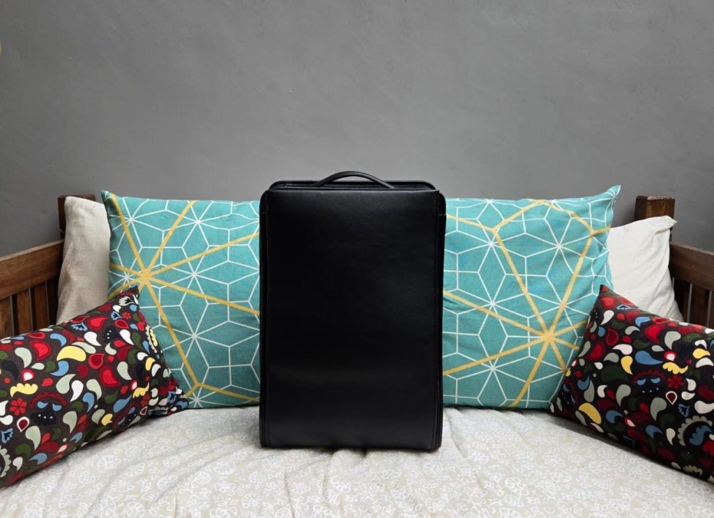
    While the adage, “big gifts come in small packages” remains valid, so too, in my case, that big gifts can also come in plain packages2. I received the gift in a rather thin simple greyish blue draw-string bag, and the bag itself at cursory glance was also plain-looking. It was black, oblong and boxlike in shape (see picture above) which – to be clear – I actually like, but it wasn’t until I really examined and begun to use it days later that I grew to love it, and as it turns out, I can say without reservation that it is the best bag I have owned my entire life.

    The first thing I love about the bag is the way it feels: the bag is fashioned out of full leather of varying kinds – with the exception of the screws, zips and hooks which are made out of polished metal with a dark grey hue. The straps, edges, handle, buckles(!) and the back and bottom area are made up of smooth and “cushiony” leather, while the rest of the bag is clothed with a coarser leather that is also so pleasurable to touch. In fact, the whole bag is a tactile heaven and touching it became so instinctual that I was called out by my bemused and amused friends for my frequent “caressing” (their words) of my bag (embarrassing but I did managed to defend my actions and got them to feel it for themselves, hah)!

    Another cause for love is the bag’s exquisite craftsmanship. Although minimalistic in design, it is clearly evident that there is much thought and dedication that went into the crafting of it. Try as hard as you may, one cannot spot a flaw within and without. From the sturdy zipper which zips seamlessly (and elicited in me the feeling of assurance that it will remain so for years to come), to the careful selection of leather parts and meticulous stitching, down to its integrative nylon(?) interior, it is hard not to agree – even for non-experts (such as myself) – that it is a well-made bag in every sense of the word.

    And finally, the look of it, namely its plainness or simplicity that is so appealing to me. The bag looks “clean” with neither patterns or prints nor even any brand logo! And it has just two compartments – one at the front and the back other. How then can such a simple look be appealing – much less “so appealing”? Well, for one, I am a fan of minimalistic designs and my love for simplicity-elegance matches the bag’s “clean” aesthetic. And another is its fittingness of the constituent parts to form a bag of strong shapeliness (rectangular in this case) with “soft” features (the angularity is overcome by rounding off the edges) which altogether exudes dignity and “inviting-ness” as both an art piece and a bag – akin to the Randoseru, ランドセル, in beautiful simplicity and functionality.

    What then is the result of this exquisite marrying of form and function in a bag? Well: awe, delight, gratefulness, and a desire to cherish and praise!

    Well done, Tsuchiya Kaban! And thanks again my Dear Friend for the gift. ありがとうございました!:)

    1. Although I classify myself as a “bag lover” I am by no means the collector/aficionado type but I write on nevertheless for the desire to write about this bag is pressing. ↩︎
    2. But certainly not without the sweet thoughtfulness and radical generosity of my giver who is my close friend of whom I am very grateful for (much love, bro) ↩︎

    Image Source: My Own

  • Good Old Flats of Pasir Ris

    Good Old Flats of Pasir Ris

    If you were to ask me which area of Singapore is my favourite, I would unhesitatingly reply the “East” but particularly Tampines, Simei, and Pasir Ris. If you were to probe further to ask why do I fancy the “East”, my reply would be because of the unique bucolic “homey” vibe it exudes. Could it be due to a biased preference since I have been living in the “East” all my life? Possibly, but I could also list down objective reasons for my preference such as its interesting circular streets, landscaping, open spaces, lower rise buildings (due to its close proximity to the airport) enabling one to see more of the skyline, and also its organicity and “homeliness” – which, sad to see, is fast dissipating due to frenetic (even vulgar) development in a utilitarian world.

    But gloom aside, I would like to highlight and commemorate one prime vestige of such organicity evinced in – what I would call – the “good old flats” of Pasir Ris.

    Back in 2022, I had a serendipitous encounter with the “Pasir Ris Heritage Trial” while researching on places in Singapore to explore as part of my fulfilment of a module in teacher-college (National Institute of Education) which I eventually embarked on. That solo trip and showcase after (through an artefact which we have to create – which is made available below) led me to delve deeper into the architecture of the old public housing flats.

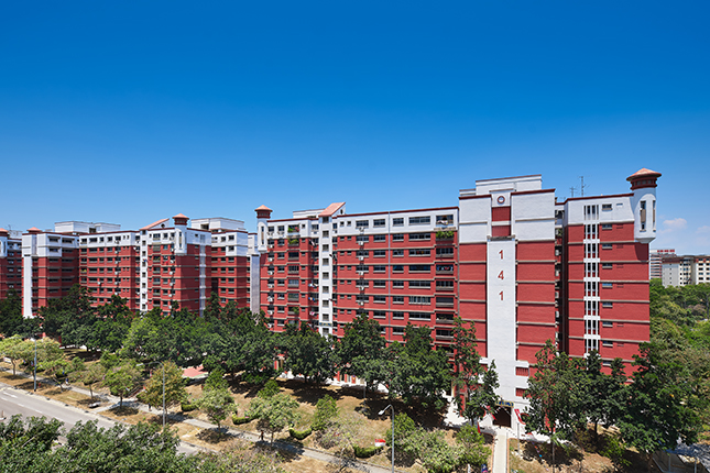
    Having spent most of my childhood in Pasir Ris, those flats were certainly not alien to me and I had always found them attractive but never wondered why until then. Coming off the trail, I was blown away by the intentionality, coherence and fittingness that went into the intricate designs of the flats as well as its landscaping based on a particular theme unique to the identity and history of Pasir Ris, that is, the “seaside resort” theme – for Pasir Ris was near the beach and had multiple beachfront hotels in the past. And in that trial I witnessed with my own eyes, the artist’s (dare I say) loving intents in features such as:

    lighthouse-shaped turrets formed by columns of balconies and grille patterns inspired by traditional tropical basket-weaving designs… void decks and precinct boundary walls feature(ing) porthole-shaped openings, and flat windows and balconies are (being) framed within clam-shaped openings.” (source:Roots)

    Needless to say, I was delighted and in all honesty a bit awestruck, not least with the amount of thought that went into the details but also discovering what it meant for buildings to have a “face” – a “soul”.

    Roger Scruton, in his book The Aesthetics of Architecture mentions a kind of facelessness existing in modern edifices whose facades of windows simply mirrors their surroundings, lacking any soul or distinctiveness which is essentially anti-human flourishing: 

    “Vast and overbearing though the modern building types may be, they never acquire an air of permanence, but recreate the city as a frozen junkyard. Their raw functionality hurts the eye and the soul, for it speaks not of us and our right of dwelling, but of them. It is an anonymous they who built these things for inscrutable purposes that lie beyond our sympathies. In losing the reference to sacred architecture that inhabited our building types from the Greeks until the beginning of the twentieth century, we lose also our conception of the city, as a place where absent generations reside among the living, and the living room reside. The real cause of the decay of our inner cities, I believe, is the architecture that has killed them.” (PXII)

    And sadly Singapore is not spared such a phenomenon: look around and notice the new housing developments (both private and public), are they not a far cry from the “good old flats of Pasir Ris” but instead reek of bland pungent functionality – resembling Le Corbusier’s vision of the house as a “machine for living in”?

    No wonder I always felt “at home” in Pasir Ris (and other parts of Simei and Tampines) especially being in the presence of such “life-giving” architecture and landscaping borne out of the location’s historical roots and distinctive characteristics, and in the converse, a feeling of alienation and uneasiness in (regretfully) other (newer) parts of Singapore. It is my prayer and hope that the “Good Old Flats” of Pasir Ris might be loved, remain, and shine as a beacon and model for new (re-)developments to come. For Shalom!

    *Image Source: roots.gov.sg